Hoe - Een afbeelding spiegelen
Leer hoe u een afbeelding kunt spiegelen (een spiegeleffect toevoegen) met CSS.
Beweeg je muis over de afbeelding:
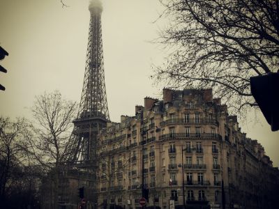
Een afbeelding spiegelen
Voorbeeld
<style>
img:hover {
-webkit-transform: scaleX(-1);
transform: scaleX(-1);
}
</style>
<img src="paris.jpg"
alt="Paris">
Let op: Dit voorbeeld werkt niet op tablets of mobiele telefoons.
Tip: Ga naar onze CSS 3D-transformaties Tutorial voor meer informatie over 3D-transformaties.
3D spiegelbeeld met tekst
Leer hoe u een geanimeerde 3D-omslag van een afbeelding met tekst maakt:
Parijs
Wat een geweldige stad
Stap 1) HTML toevoegen:
Voorbeeld
<div class="flip-box">
<div class="flip-box-inner">
<div class="flip-box-front">
<img src="img_paris.jpg"
alt="Paris" style="width:300px;height:200px">
</div>
<div
class="flip-box-back">
<h2>Paris</h2>
<p>What an amazing city</p>
</div>
</div>
</div>
Stap 2) CSS toevoegen:
Voorbeeld
/* The flip box container - set the width and height to whatever you want. We
have added the border property to demonstrate that the flip itself goes out of
the box on hover (remove perspective if you don't want the 3D effect */
.flip-box {
background-color: transparent;
width: 300px;
height: 200px;
border: 1px solid #f1f1f1;
perspective:
1000px; /* Remove this if you don't want the 3D effect */
}
/* This
container is needed to position the front and back side */
.flip-box-inner {
position: relative;
width: 100%;
height: 100%;
text-align: center;
transition: transform
0.8s;
transform-style: preserve-3d;
}
/* Do an horizontal
flip when you move the mouse over the flip box container */
.flip-box:hover .flip-box-inner {
transform: rotateY(180deg);
}
/* Position the front and back side */
.flip-box-front, .flip-box-back {
position: absolute;
width: 100%;
height: 100%;
-webkit-backface-visibility: hidden; /* Safari */
backface-visibility: hidden;
}
/* Style the front side (fallback if
image is missing) */
.flip-box-front {
background-color: #bbb;
color: black;
}
/* Style the back side */
.flip-box-back {
background-color: dodgerblue;
color: white;
transform: rotateY(180deg);
}